How to Turn Website Visitors into Paying Customers
Traffic alone does not pay the bills. A website can attract thousands of visitors a month and still struggle if those visitors leave without taking action, asking a question, starting a trial, or making a purchase. Learning to turn website visitors into paying customers is not about tricking people into buying. It is about removing friction, building trust quickly, and making the next step so clear and so low-risk that the right visitor can say yes with confidence.
In this guide, you will learn a practical, repeatable system for improving conversions. We will cover how to understand visitor intent, how to strengthen your offer and landing pages, how to use social proof and follow-up, and how to test changes without guessing. Whether you sell software, services, or physical products, the same principles apply: match the message to the moment, prove the value, and make buying easy.
1. Start With Intent, Not Just Traffic
Not every visitor wants the same thing. Someone searching for a definition is learning. Someone comparing two tools is evaluating. Someone searching for a price, a demo, or a specific plan is much closer to buying. If you send all three groups to the same generic homepage and show them the same call to action, you will lose the buyers and overwhelm the learners.
Start by sorting your pages by intent. Informational content should educate and invite a small next step, such as joining an email list or reading a related guide. Comparison and review content should help a reader decide, with clear differences, honest trade-offs, and a recommendation. Sales pages should focus on the outcome, the price, the guarantee, and the button. When the page matches the visitor’s stage, conversion becomes a natural next step rather than a hard sell.
Use analytics to see where people enter, where they leave, and which pages already convert. A page with high traffic and a high exit rate is often a message problem, not a traffic problem. A page with low traffic but a strong conversion rate may deserve more promotion. Let the data tell you where to work first, and fix the biggest leaks before you chase more visitors.

2. Make Your Value Obvious in Five Seconds
Visitors decide fast. Within a few seconds, they ask three questions: What is this? Is it for me? What should I do next? If your headline is clever but vague, or your page opens with a long story about your company, you will lose people before they ever see your offer.
Write a headline that names the outcome and the audience. For example, instead of “Solutions for Modern Businesses,” try “Book More Calls Without Hiring a Full-Time Sales Team.” Follow it with one supporting sentence that explains how you deliver that result, and one primary call to action. Keep navigation simple on landing pages, remove competing buttons, and repeat the main action after each major section so a convinced reader never has to scroll back to the top.
Your hero section should also answer the risk question early. A short line about a free trial, a money-back guarantee, no credit card required, or flexible pricing can lower the barrier to trying. Do not hide the price or the next step behind three clicks if a visitor is ready. Transparency builds trust, and trust is what turns curiosity into a purchase.
3. Design Pages That Guide, Not Distract
Good conversion design is quiet. It uses one clear visual hierarchy, generous white space, short paragraphs, and scannable headings. Break long explanations into sections, use bullet points for benefits, and use images that show the product in use rather than generic stock photos that say nothing about the result.
Every form is a filter. Each extra field reduces completions, so ask only for what you need to start the relationship. On a first step, name and email are often enough. You can collect company size, budget, or project details later, after the visitor has already shown interest. The same rule applies to checkout: offer guest checkout where possible, show progress, explain shipping or setup costs early, and make errors easy to fix.
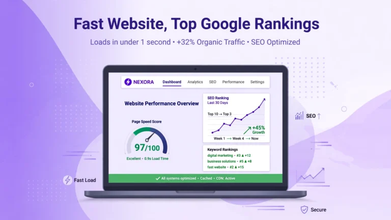
Mobile deserves special attention. Most visitors will first meet you on a phone, so test your pages on a small screen, not just on a desktop. Buttons should be thumb-friendly, text should be readable without zooming, forms should use the right keyboards, and pages should load quickly. A slow page is a silent conversion killer, and reputable research from Google has repeatedly linked page speed to bounce rates and conversions. You can read Google’s guidance on Core Web Vitals and check your own pages with PageSpeed Insights.
4. Use Proof That Matches the Doubt
People do not buy because a page says a product is great. They buy because they believe the result is real, relevant, and achievable for someone like them. That is why social proof works best when it is specific. A testimonial that says “Great tool!” is weak. A testimonial that says “We increased demo bookings by 31% in six weeks after simplifying our signup form” answers a real doubt.
Show proof near the decision point, not only on a separate testimonials page. Place a relevant review, case study, or result next to the price or the signup button. Include logos only if they are genuine, and include numbers only if you can support them. Honest proof is more persuasive than exaggerated claims, and it protects your reputation when a customer compares your promise with their experience.
Follow-up is where many sales are won or lost. Most visitors are not ready on the first visit, so give them a reason to return: a useful checklist, a short email course, a comparison guide, or a low-cost starter offer. Then follow up with helpful, specific messages — not a flood of generic promotions. A well-timed email that answers the objection a visitor had on your pricing page can be more valuable than another discount. Our guide to the best email marketing software for small businesses can help you choose a tool for that follow-up system.

5. Offer a Low-Risk First Yes
Buying is a commitment, and commitments feel risky. Reduce that risk by offering a smaller first step. A free trial, a sample, a short consultation, a money-back guarantee, or a starter plan all let a visitor experience value before paying in full. The first yes should feel easy; the full purchase can follow once trust is earned.
Be clear about what happens after that first step. How long is the trial? What is included? What happens when it ends? Will the visitor be charged automatically? Surprises destroy trust, so explain the process in plain language. If you use urgency, make it honest: a real deadline, a real limited bonus, or a real stock limit. Fake countdowns may lift a sale today and cost you refunds, complaints, and repeat business tomorrow.
6. Test One Change at a Time
Conversion optimisation is testing, not redesigning on a hunch. Pick one hypothesis, such as “a shorter form will increase demo requests,” change only that element, and measure the result for long enough to matter. If you change the headline, the image, the price display, and the button all at once, you will never know what worked.
Start with high-impact tests: the headline, the primary offer, the form length, the price presentation, and the first call to action. Use a simple before-and-after comparison when traffic is low, and use a proper A/B test when traffic is high enough. Record what you tested, what you expected, and what actually happened. Over time, that record becomes a playbook for your whole site.
Also test the parts visitors never see in a screenshot: email subject lines, onboarding messages, and support replies. A customer who gets a fast, helpful answer is far more likely to upgrade than a customer who waits two days for a generic response. Tools that answer instantly can help here, and our review of the NotiQ lifetime deal shows how AI lead tools can capture and follow up with visitors around the clock — a useful complement to the conversion system in this guide.
7. A Simple Conversion Checklist
- Match each page to the visitor’s intent and stage.
- State the outcome, the audience, and the next step in the first screen.
- Remove unnecessary form fields and competing calls to action.
- Show specific proof next to prices and signup buttons.
- Offer a low-risk first step and explain what happens next.
- Follow up with helpful, relevant messages — not just promotions.
- Make the page fast and easy on mobile.
- Test one change at a time and keep a record of results.
Conclusion: How to Turn Website Visitors Into Paying Customers
Turning visitors into paying customers is rarely about one clever trick. It is the result of many small, honest improvements: clearer headlines, simpler forms, stronger proof, faster pages, and follow-up that actually helps. Start with your highest-traffic page, fix one leak, measure the change, and then move to the next. Small gains compound, and a site that respects a visitor’s time and intelligence will always outperform a site that only shouts louder. When you match the message to the moment, prove the value, and make buying easy, you turn website visitors into paying customers again and again.
If you want a shortcut for the follow-up part, explore lifetime SaaS deals that help you capture leads, automate email, and respond faster — but judge every tool by the same standard as this guide: does it make the next step clearer, easier, and more trustworthy for your customer? When the answer is yes, the sale usually follows.